Publishing Platform for Retail (PPR) is a SaaS solution to help retail stores to manage the printing of price tags for their products or send information to price LED panels (like the ones used at Kohl’s or JCPenney).
Claudia Castro
Scott Kendal
Shuang Xu
Andy Matiice
Rajib Dutta
Justin Redak
Dean Nellis
UX designer (me)
UX Researcher
UX Manager
Marketing Director
Lead Developer
Sales Director
Graphic Designer
User research protocols
Ideation
Wireframing
Design specs
Research observer/note taker
Hall testing
Contextual inquiry
Participant screeners
I developed the following personas based on a Contextual inquiry done with one of our costumers, and the information gathered from marketing.
PPR has two in-stores solutions: one made to print out labels/price signs in bulks mainly for store managers, sometimes by retail associates (web-app solution) and another one to correct or create tag prices on the go (usually very small batches of signs created with a zebra scanner-phone size device). This solution also has a CMS that only was visible by system administrators.
For this portfolio, I am primarily focusing on the in-store web-app solution.
christina-wocintechchat.svg)
Taylor - System admin (Corporate)
iwaria-inc.svg)
Meghan - Store Manager
Needs to print out labels in bulks with pre-made templates, so that retail associates can replace the old price labels with the new ones.
bluebird-provisions.svg)
Alex - Retail Associate
Needs to verify product details, and create small batches of signs/price labels on the go.
NOTE:
Some of the customers at the time I was working with this product included: JCPenney, Love's (travel stop - convenience stores), BJ's, Bed Bath and Beyond, and various European supermarkets.
Retail stores have thousands of products and there are many variables associated with each item.
Requirements were gathered and channeled by marketing.
For this particular project we user tested another’s designer work with both real customers (remotely) and paid participants with relevant experience. We recruited participants through an agency and brought them to Lexmark’s usability lab. My job was to provide the participant screener guidliness for the agency, design the user testing protocol, help running the usability testing, and address issues found during the usability testing. PPR is a revamp of AccessVia, which was acquired by Lexmark. During my time at Lexmark, PPR was the most profitable software in the company’s portfolio services.
Some of the main issues found were:
Batches of signs were created for users and these batches were named automatically. Users were confused and could not find the batch they just had created and most of them did not even notice they created a batch to begin with, neither did they read the banner.
Users had a hard time trying to find the product library. Users got stuck between the item library and the the “view batch.” The pages were alike, and it was hard for participants to know where they were. Some corporate participants suggested that the word create used in the item library implied something completely new.
Most corporate users found the print IU had redundant information, that It was not clear what had been printed. Mainly because there was an animation pushing up an ongoing job, and replacing it with a new, therefore the print status was completely out of view. Users did not notice or understand how to select or deselect a sign from a group to print. Users did not know what the grey bubbles meant.
NOTE: The designs I delivered did not have the corporate colors. After my work was done, they were turned to graphic design, and they rendered the designs with the brand colors and styles.

The task given to users was to create a group of signs. Information of several products were given to participants to complete the task.
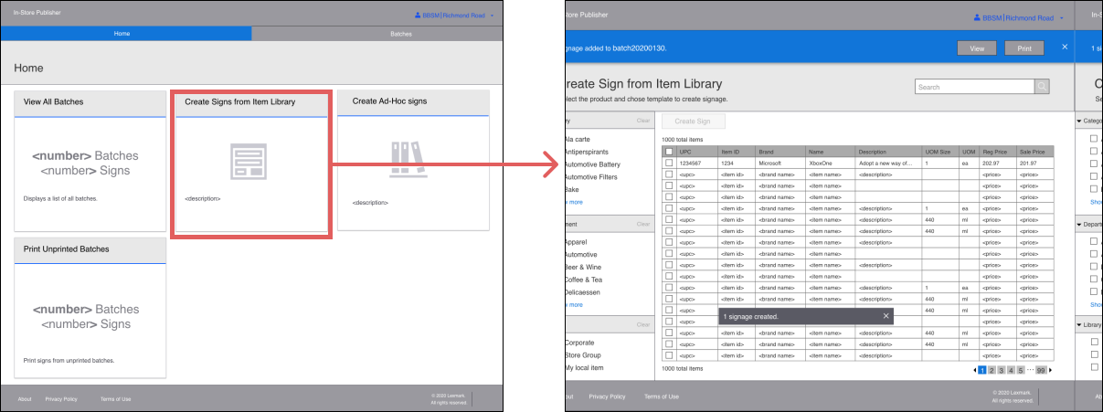
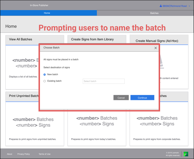
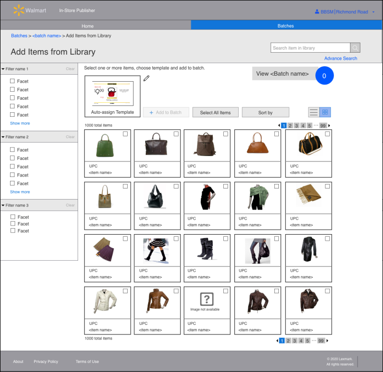
Participants did not click on the “view” button. Banner was ignored by them. “View” button would have taken users to the batch list. Instead, they went back and took other routes. When they finally landed on the batch list they thought they were in the creating batches workflow, the main reason is because the two pages were similar. All this, added to a potential customer request that the items of the item library (library of products) would have images let to the following design:
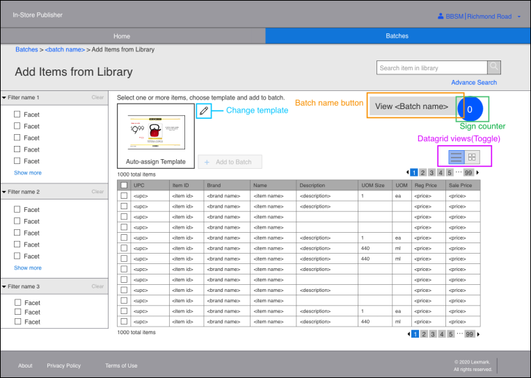
This solution for the most part had positive feedback after testing. This is the final design after a few modifications done after the second test.
Library with product/item pictures
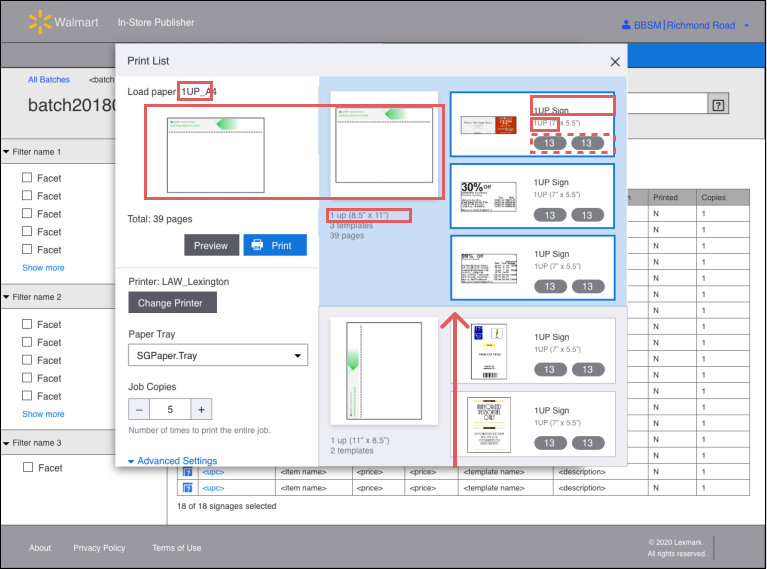
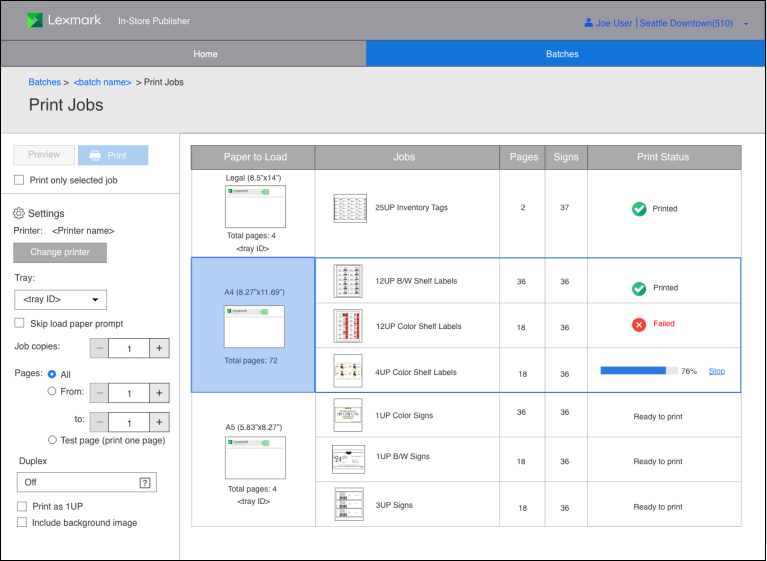
I did not get to test this design.
PHOTOGRAPHY CREDITS:
Produce at a grocery store cover - Gemma (Unsplash.com)
Taylor (persona) - christina-wocintechchat (Unsplash.com)
Meghan (persona) - Iwaria inc (Unsplash.com)
Alex (persona) - bluebird-provisions (Unsplash.com)